Bootstrap
What is Bootstrap?
Bootstrap is set of css and javascript files that take css to a higher level of abstraction and makes responsive web sites easier to build.
Where to get Bootstrap3?
Visit GetBootstrap.com to get the css and javascript files.
A great tutorial for Bootstrap 4 is websitesetup.org/bootstrap-cheat-sheet/
Basic Concepts
All bootstrap elements must be inside a "container" element, often a "div" tag, or the body element.
A container is a page level attribute and cannot be nested, but it is common to have a header container, a body container, and a footer container, but these cannot overlap.
A div with the class of ".container" will center content in center of viewport. A div with a class of ".container-fluid" will always takes up full width of browser or viewport.
Within the container are a series of "row" divs.
Within the "row" are 12 columns.
Visual Breakpoints
Visual breakpoints are how bootstrap arranges the 12 columns with different sizes of devices.
| Breakpoint | Pixel Width | Name | Devices |
|---|---|---|---|
| xs | Extra-Small | <768px | phone |
| sm | Small | >=768px | tablet |
| md | Medium | >=992px | desktop |
| lg | Large | >1200px | desktop |
Example of a class: If an element has a class of "col-sm-6", it means on small devices, and everything larger the element will be 6 columns wide. It has no effect on devices smaller than that, i.e., "xs".
Mulitple classes can be assigned to an element, for example, "col-sm-3 col-lg-5".
class="col-md-6 col-xs-12" to specify 6 columns on regular, but on phones take all 12
Meta-tags for devices
For bootstrap to work in the head section we need to include the viewport meta-tag, the JavaScript and the css files:
<!-- include Bootstrap libraries -->
  <meta name="viewport" content="width=device-width, initial-scale=1">
  <link rel="stylesheet" href="http://maxcdn.bootstrapcdn.com/bootstrap/3.3.5/css/bootstrap.min.css">
  <script src="https://ajax.googleapis.com/ajax/libs/jquery/1.11.3/jquery.min.js"></script>
  <script src="http://maxcdn.bootstrapcdn.com/bootstrap/3.3.5/js/bootstrap.min.js"></script>
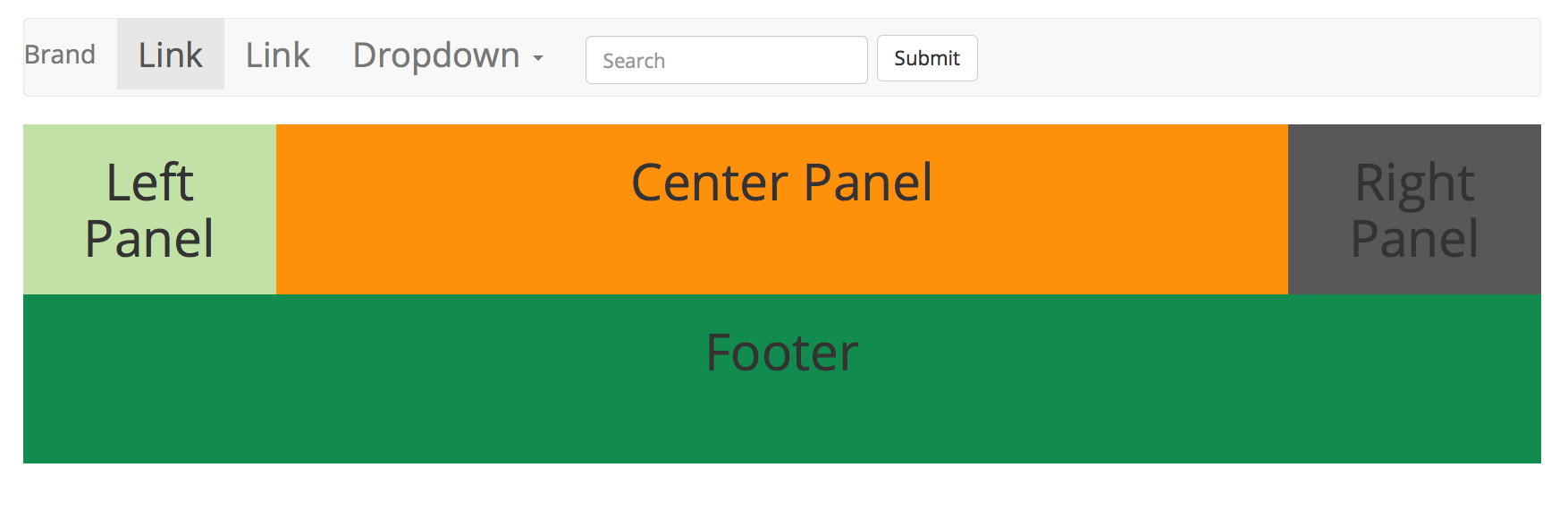
Now inside the body we can create three columns in one row with widths of 2,8, and 2.
<div class="container-fluid"> <!-- main div -->
<div class="row">  <!-- row -->

<aside class="col-sm-2 leftPanel bordered" > <!-- left panel -->
<h1>Left Panel</h1>
</aside>

<section class="col-sm-8 centerPanel bordered"> <!-- center panel -->
<h1>Center Panel</h1>
</section>

<section class="col-sm-2 rightPanel bordered"> <!-- right panel -->
<h1>Right Panel</h1>
</section>

</div>  <!-- row -->
Here is a very basic example of the "mostly fluid" pattern, it will simply stack all the sections when viewed on a xtra-small device (i.e., when the width is less than 768 pixels): Mostly Fluid, view it then right-click and "View Source".
To move columns around we use "push" and "pull" classes. For example, "col-sm-pull-8" will pull the column to the left 8 sections for everything larger than "sm" size.
To hide and entire column at the "sm" size, we use the "hidden-sm". To make then visible use "visible-sm". For example, to hide a column only on phones use these classes: "hide-xs visible-sm".
Here is another example of the "mostly fluid" pattern, but instead of stacking, we will move columns: Mostly Fluid, view it then right-click and "View Source".
Responsive Navigation
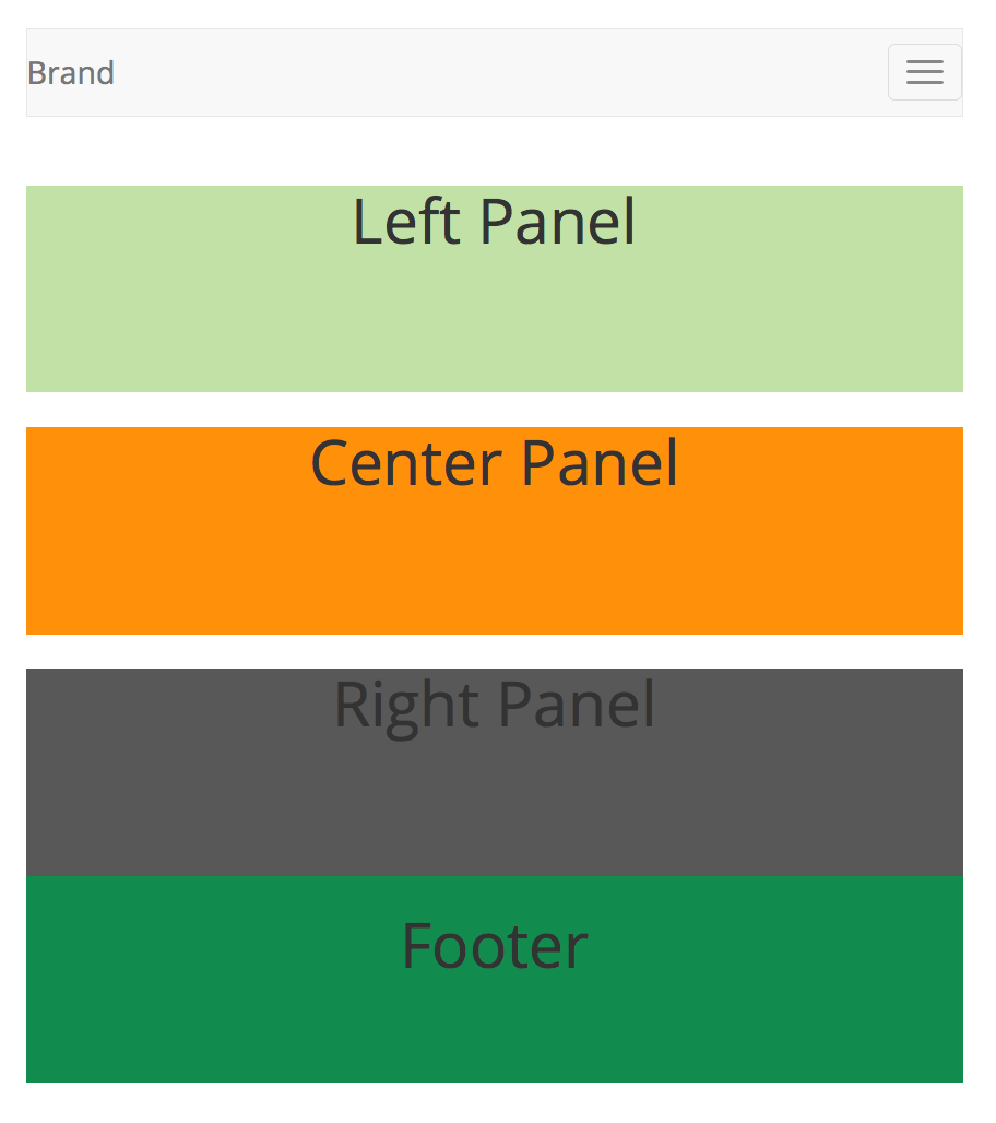
An example Bootstrap navigation bar based on the one from GetBootstrap.com is here.
And seen on a phone it looks like this:
Links and Other Items
links: lukew.com
To see how the page will look in various devices use the developer extension in Chrome and select "command-option-i" on the mac and click on the little device icon at the upper-left.